
Having an online presence is popular in today’s digital world. People use it to share their daily activities, to contact with their friends, to showcase their expertise and knowledge, and even to start an e-business. As investigated, there are millions of blog sites published online every day. This huge popularity makes it difficult for you to make new blogs stand out from the crowd. In this case, there are so many tutorials concerning about how to make a blog attractive, among which the overall design tips are the most effective ones. After all, before going through the content, people view the appearance and content layout firstly when they enter your website. Here, we’d like to unveil the top 5 tips, helping you pique your readers’ eyes easily.
Landing Page Design
It seems that the majority of bloggers pay little attention to the creation of landing pages; some of them even ignore this aspect. However, the fact is that 80% of real popular blog sites have an effective landing page used to summarize the main content of the site or to act as a special entering channel to the blog.
- Simple Words – The easiest landing page only contains some simple words that can introduce your blog site the best. For this kind, you need to highlight the color contradiction between text and background.
- Animated Image – To increase the attraction, you can use the animated graphics for your landing page. This kind cannot summarize your site, but can arouse readers’ interest to click their mouse to enter your content.
- Multimedia – Video and audio are also good elements to add into your landing page. However, you need to pay attention to file sizes as the large files may affect your page loading speed.
These are the three basic types of landing page. You can choose one of them based on your needs. Also, you can refer to another 7 factors when it comes to the creation of landing pages.
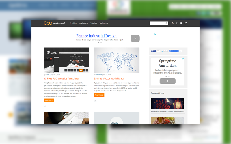
Header and Footer
Generally, a good header should include a clear and horizontal navigation bar, a unique website logo and the website title with a proper font and size. Even, you can spare a small space for the advertisement of your major sponsor or advertiser. Here, we have to note that the header needs to stick to a principle of simplicity, and each component needs to be placed properly. Fusion Vegas web developers can help set up your site and attract more people.
As for the footer, we highly suggest you to cut it into two parts – one for the brief introduction of website or site owner, and another for some site links including Contact Us page, About Us page, Archive page and most-used tags. After checking hundreds of website online, we find that PHPMatters has done the best job in this respect.
Sidebars
We have found that many bloggers use the sidebars in both right hand and left hand of a webpage. In fact, this practice can do no good to the website design due to the following two reasons.
- The central content will be squeezed into a small piece, making your text formatting strange especially when you want to insert some images that are right/left aligned.
- The items listed on the two sidebars may act as distractions for readers to focus on your blog content.
Here, we highly suggest you put a right-hand sidebar containing your recent posts (check out this source), category links and some ad spaces. Here, we do not recommend your put the sidebar at the left, for people are more likely to make a click on the items placed near the mouse.
Search Button
As for the creation of search button, different people have different preferences. In this case, we have carried out a research and have found that 93% of readers prefer a search button to be placed at the right-hand sidebar, coming with a magnifier image and a blank space for keyword entering. Therefore, if the design and placement of a search button do not affect your overall design obviously, you can think about this result.
Popup Contact Forms
A contact form can help you collect your readers’ information easily and send them newsletters when you are updating your website. At present, there are so many popup contact form plugins and generators, so you can create one without much hassle. The only things you need to consider are that the form size needs to be proper that is around 3 quarters of the whole page size. Not too large or too small. As for the form content, you’d better not to include too many items. Generally, the name, email address and the top suggestion are enough.
Leave a Reply