
Last autumn a client sent back a billboard proof with one line on it: the campaign title looks like a ransom note. Same file, same typeface, same words. It read fine on the 24px mobile banner and fell apart at 140px, where the hairlines dropped out at eight metres and the spacing opened into gaps that were never there on screen.
Nothing was broken. The face was drawn for one size and used at another. Headline type is a different purchase from body type: narrower job, fewer weights that matter, and almost no free display face on Behance was drawn to survive both a phone and a wall.
What breaks when a headline goes from 24px to 140px
Spacing goes first. Type that feels tight at 24px looks loose at 140px, because the gaps grow with the letters. Pull tracking in about 1% per doubling in size and most headline problems vanish.
Stroke weight is second: a Light cut that looks elegant in a browser is gone at eight metres. Third is x-height, because on a 390px phone a headline lands near 32px and lowercase needs height there. We test at 32, 64 and 140px on paper, screenshot a phone, and drop anything needing three fixes.
Editorial and serif display
These carry a sentence rather than a word, which is most headlines in publishing.
Klinic Slab

Four weights with italics, and the slabs give a 32 to 60px section header real authority. Above 90px the serifs read as heavy brackets. Personal use only. Download
Aleo

Six styles on Google Fonts, and the most forgiving at 40 to 64px because the contrast is low. Past 100px the rounded corners go childish, and there is no condensed cut. Specimen
Bitter HT

Drawn for screen reading, so it holds at 28 to 48px where other slabs clump, with enough weights for a hierarchy. At poster size set tracking near -2% or the words drift. Download
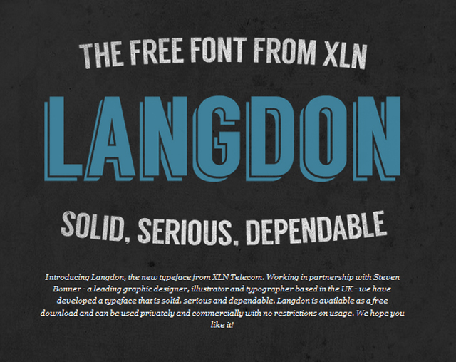
Langdon

Heavy condensed sans with an inline variant, caps only, given away by XLN Telecom. A packaging face where the words are three characters tall. The download page has been dead for years.
Condensed and brutalist: when the line cannot get shorter
All five are caps-only. They buy width and charge you the difference between a headline and a label.
Norwester

Geometric condensed caps with small caps and figures, and the cleanest answer for a long name in a narrow space. Below 16px the joins fill in. Download
Canter

Six weights, all caps, drawn as display type – enough to build a whole poster from one family. The light cuts fade at distance. The Fontfabric source errored all year.
Bebas Neue

The default I-need-a-big-headline font, which is also its problem: three of four thumbnails in a crowded feed use it. Nearly indestructible, but the tight spacing makes letters touch at 140px. Download
Economica

Drawn for newspaper print, and the ink traps stop letters filling in at 16 to 22px on cheap stock. At 140px those traps turn into notches. Download
Boomtown Deco

Condensed deco caps with an inline cut, right for a theme night or an event poster that wants theatre. The inline strokes vanish below 30px on screen. Download
Geometric sans and one mono
Safe is not an insult. Half the headlines on the web should use one of these and get out of the way.
Glober

Six weights and nothing in it argues with a photograph, which is why it lands on corporate work. Above 100px the round bowls feel generic.
Campton

Tall x-height on a geometric skeleton, which is why it holds at 24px on a phone: lowercase stays open where Glober closes up. From 100px upward the round forms go soft. Download
Farray

Bauhaus-inspired with broken letters – the F and the R lose a chunk – and one weight, which says what it is for: music posters, a zine cover. At 18px short words become guesswork. Download
Flagship

Monospaced slab from 2013 that still reads as a system rather than a trend. Every character takes the same advance, so a headline runs a third longer than in a proportional face. Download
Odin Rounded

Rounded terminals, free for personal and commercial work, and it suits playful packaging at 36 to 60px. At billboard size the softness reads as a toy font, and the foundry page now errors.
One script, kept as a signature
Blenda Script

A bold vintage script out of Lobster’s skeleton, free for personal and commercial use per the Behance listing. One word only – stamp, logo lockup, shop sign – because three lines of connected script is a knot. For scripts that carry real text, see the 24 free script fonts. Download
Pairing a headline face with body text
Two moves work. Contrast by structure: a serif or slab display over a neutral sans at 17 to 19px with 1.55 to 1.65 line-height. Or contrast by weight alone: one family, 700 above and 400 below, which ages best because nothing can fall out of sync. Two decorative faces in one layout fail.
Keep the jump at 2.5:1 to 4:1. Below that the hierarchy disappears, above it the headline crowds the paragraph. A real weight axis saves the second purchase; our notes on variable fonts for web design cover which ones ship usable ranges.
The mistake: a display face with one weight
Five of the fonts above ship in a single weight. Fine for a one-off poster, a trap for a site, because hierarchy then comes from size and letter-spacing alone. Sooner or later someone fakes the bold, and the browser synthesises it by smearing the strokes sideways instead of redrawing them. At 24px that smearing is the first thing a designer notices.
Three or more weights with true italics lets you build a page from one font. One weight means a second family, two sets of spacing rules, two line-heights, one more thing to check on every template. We run sizes through our design tools first, because a face that fails at 32px is not saved by looking good at 96px.
Headline font questions
Do I need a separate face for headlines?
Only above about 60px, or when the layout is the product – a poster, a cover, a campaign. Below that a text family with a real bold does the job. A display face earns its place when the letterforms do work the sentence cannot.
What size should a mobile headline be?
28 to 36px on a 390px screen, measured against line length rather than fashion. Past 44px you are down to three words per line, fine for a hero and wrong for an article title.
Can I use these on a paid client project?
Case by case. The Google Fonts entries are OFL. Lost Type grants personal use only. Behance and Dribbble uploads run from free for commercial work to personal use with a donation link, and four sources here are offline, so we would not ship those.
Worth reading next
More faces in the same vein sit in the fonts category, and if the headline needs a laugh instead of authority, the comic fonts collection covers the other end of the scale.
Leave a Reply