
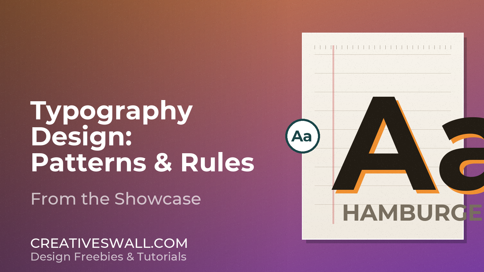
Typography is the fastest way to signal quality – before anyone reads a single word. This showcase walks through great typography design patterns we admire, plus practical rules you can apply to your own projects today.
What Makes Typography “Great”?
- Hierarchy – the eye knows where to start and where to go.
- Pairing with purpose – a display face plus a hard-working body face.
- Generous spacing – letterspace, line-height, and margins breathe.
- Restraint – one strong idea per composition.
Patterns From the Showcase
- Big editorial headings – oversized serifs with tight leading.
- Small caps elegance – refined labels and eyebrow text.
- Mixed-weight contrast – light body with a bold accent word.
- Geometric hairline rules – structure without clutter.
Rules to Steal for Your Next Layout
- Never set body text wider than about 60 characters per line.
- Keep line-height around 1.4-1.6 for comfortable reading.
- Limit your palette to two font families per project.
- Align to a rhythm – match text baselines to a simple grid.
Great typography looks effortless, but it is all deliberate spacing. Start with these rules, break them only after you understand why they exist.
More Free Design Resources
Looking for more free design assets? Explore these related collections, fonts and tools from Creatives Wall:
- 45+ Typography Designs
- 35 Amazing Typography Designs For Inspiration
- 24 Free Script Fonts for Elegant Logo Design
- 50 Free Gradient Backgrounds in PSD & PNG
Advertisement