

A client wanted a linen backdrop behind a honey jar for a print catalogue. 300dpi, 42cm spread, and nothing in our library survived it. Every cloth photo turned to grey mush.
So we shot a tea towel on the studio floor, and it beat anything we could have licensed. Thirty-five previews follow, sorted by material, because wool and satin fail in different ways. Most are crops, not downloads, and several 2014 sources have died since. Where one still loads, the image links out.
Cotton and linen, for mockups that end up in print
Cotton is behind most free textile textures, and it fakes better than anything else. Regular weave, matte surface, no baked highlights to argue with the light you give it.
Plain weave, seersucker and terry
Open the seersucker close-up for the structure alone. Those puckers are woven with two yarn tensions rather than printed on, which is why the pattern survives being shrunk to 15% for a packaging render. The plain weave beside it is the workhorse. At 20-30% multiply under body copy it vanishes into the paper. Terry is looser. Bathroom scenes only.


Creases, drape and grunge
Creases carry direction, and that is the part people skip. Cloth photographed hanging hands you a light-to-dark gradient nobody paints convincingly, so it does half the work when a flat product of your own sits on a tablecloth you never shot.
The grunge cloth from Raduluchian is the harsh end: hard folds, dirt in the weave. The blue preview at 1300 by 1860 is the only file here with pixels for a full-bleed background. Stretch the rest past a product shot and you see them, which is why we stopped forcing small textures into logo mockup scenes.


Knits and wool, the warm half of the set
Almost everyone scales knit wrong, and always too small. A stitch has a real width. If the knit wraps a 20cm product, the stitches match that product, not your canvas.
Ribbing, loops and sweater weight
The wekkity pack is chunky gauge, shot flat, and takes tinting well: in the preview one stitch sits around 40px wide. Blown up to a 2400px banner it hits 90px and looks like rope. Crop in. The juuichimei frames are finer, closer to jersey.


Wool, woven lines and felted surfaces
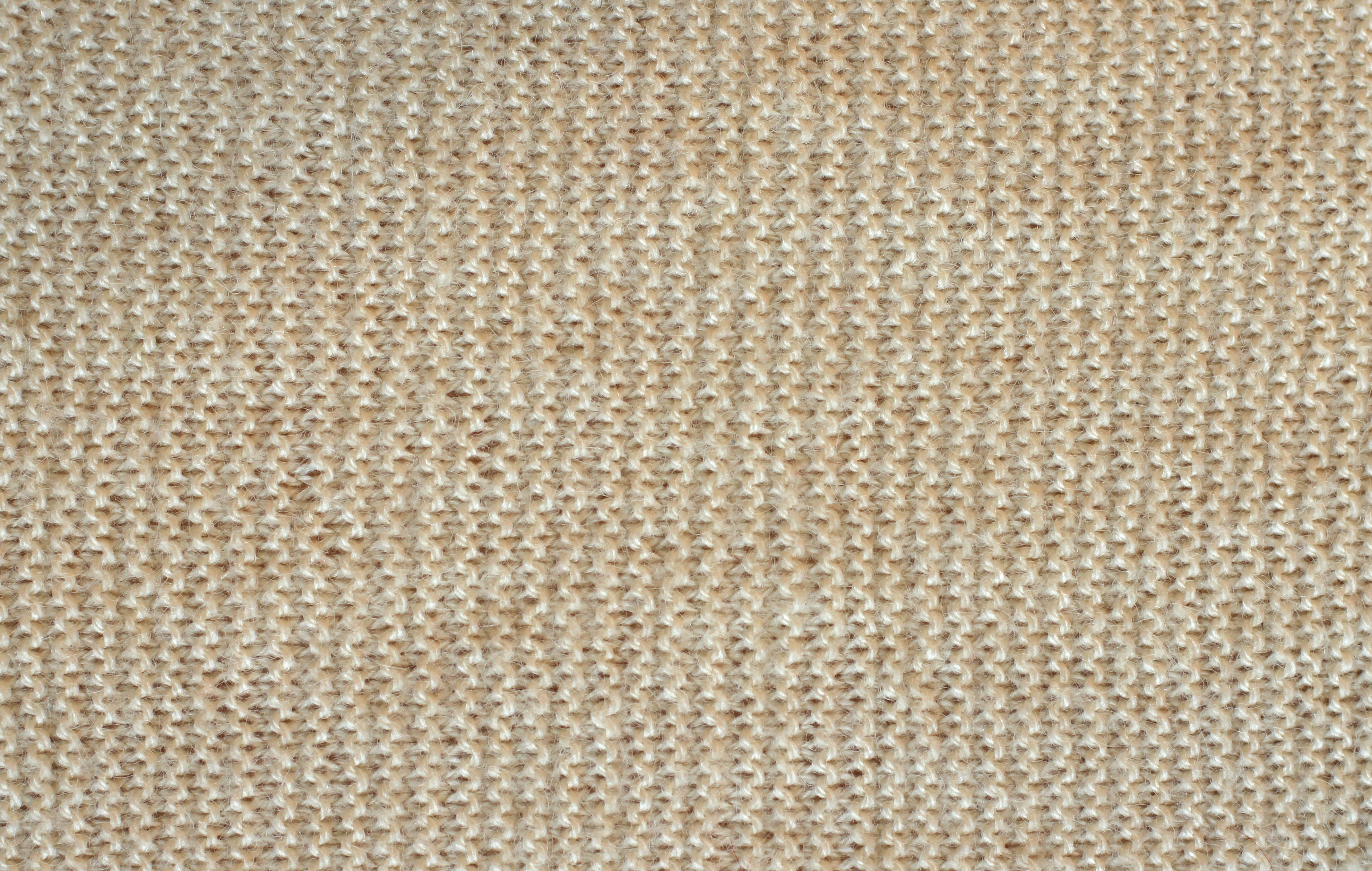
The beige wool scan from Wikimedia is the least exciting file here and the most useful. Flat, evenly lit, no shadow anywhere. Multiply it at 12% over cream and the paper feels like fibre instead of RGB grey. The lined woolens are another job. Structural stripes hand you a pattern for free, then fight any element carrying its own.


Canvas, burlap and the heavy weights
Heavy cloth survives enlargement, and the shadows between threads give a render depth. Get the scale wrong and a burlap sack wraps around a phone.
Canvas, duck and matting
The matting frame has a dense, industrial surface, closer to a carpet sample than a sofa, and the carpet-like material beside it is coarser still, with a directional pile that only shows when your light arrives from the side.


Two frames from one photo session
These two come from the same Bittbox shoot, which is rare. Same cloth, light and camera. Two textures from one session look like one world. Matching them saves twenty minutes of grading.


Silk and satin, where every mistake shows
Satin cannot be faked with a filter. The sheen is specular, and baked-in highlights argue with your Photoshop light.
Satin and silk sheen
The gold satin preview is a texture you place, not one you blend. Its highlights are committed. Light from that side, or mask the brightest third of the frame. Silk is gentler. Ridge lines multiply down to something like a well-printed brochure.


Dyed cloth in red and green
Saturated dye is its own problem. The red channel nearly clips, so 10 points of saturation flatten the folds into one shape. Desaturate first, tint after, and the creases come back.


How to blend a texture without it looking pasted
Nine times out of ten the problem is the layer stack, not the cloth. The usual mistake is letting one texture cover the product and the table both, because real cloth catches the object’s shadow and the object hides most of the weave.
- Cloth goes above its surface and below anything that casts a shadow. A texture multiplied over an existing shadow darkens it twice, and the object starts to float above the surface holding it up.
- Multiply for light or neutral cloth: it keeps the weave but crushes a dark product, so mask off the shadow side.
- Overlay when the weave should catch light instead of darkening. On a busy photo it doubles the detail.
- Screen for pale cloth on dark scenes only. Never past 25%.
Then fix the colour. Cloth shot near a window is warm, your render is neutral, and the eye reads that mismatched temperature as fake long before it ever notices the weave underneath. Desaturate, then tint toward the render’s white point with a Color layer.
Perspective is the other tell. Use Transform then Distort and pull the four corners onto the plane, because rotating a square texture onto a receding tabletop never lands and always reads as a sticker. Across the depth of a tabletop the weave compresses by about 10%, and that compression is what your eye actually checks for. Add 2-3% noise at the end; a scaled texture is cleaner than the rest of the frame.
Getting the physical scale right at 300dpi
Almost no pack tells you how big the cloth is. One weave cell of cotton is roughly 1 to 1.5mm. At 300dpi a millimetre is 11.8 pixels, so a cell lands at 12 to 18px, while 60px cells are a tablecloth.
Run it backwards and it gets useful. A 1200px crop of cotton at correct scale covers about 10cm of real cloth; your mockup wants 30cm across 2362 pixels. Sharpening will not close that gap. Tiling rarely helps either, because weave drifts and threads double up. Offset the file and the repeat appears. For cropping without resampling, the design tools page does it in the browser.
What this collection is missing
No technical weaves. No ripstop with its reinforcing grid, no neoprene, no webbing, no tarpaulin. That is a real gap for sportswear and bags, and no filter closes it. A strap off an old backpack on white foam board, lit from one side, beats most paid packs.
Packs and contact sheets, if you want to download in bulk
The index cards
These four are covers, not textures. The wide strip only helps you choose. Two of the original pack pages are gone.


One pack, five cloths
These tall previews come from a single 2014 pack, and they are the most print-ready group here. The tallest is 667 by 1007, so think detail panels.


Questions we get about fabric textures
Can I use these in client work?
Check the page you downloaded from, not this list. The Wikimedia files are public domain or Creative Commons encyclopaedia material. The DeviantArt accounts are stock galleries that usually allow commercial use and ask for a credit link.
Why does my texture look like wallpaper?
The repeat is visible, the scale is wrong, or the layer sits above the shadows. Usually all three. Fix scale first. Cloth at the right size hides a lot. Then mask it around the product and add grain.
What resolution do I need for print?
300dpi at final size, which is harsher than it sounds. A 640px preview is 5cm wide at that density, and a full page needs an original in the 3000px range.
More cloth and paper packs sit in the Freebies archive, alongside the gradient and mockup sets we keep coming back to.
Leave a Reply